Wednesday 04/13/2016 by Lemuria

DON'T SNOOZE ON SUNDAYS?

Among the many data elements on Phish.net, users' ratings of shows receive a disproportionate amount of critique. They are generic by design, suspected of some biases, and used differently by different users.* But despite their flaws, the ratings are still informative**.

We’ll start with an arcane issue: how show performance varies by day of the week. While some fans may love the Friday/Saturday blowout, many warn to “never miss a Sunday!”. Similarly the band’s “you snooze, you lose” mantra has emphasized that sparks happen in expected places on unexpected nights. An analysis of show ratings helps to consider each of these ideas, as well as to identify some interesting variations.

All at Once

First, let’s look at the ratings*** for all 1701 known shows. If we take the average rating for each show, and then average those averages by weekday, Sunday is indeed tops - with a mean average of 3.87 just edging out Friday (3.82) and Saturday (3.85). However, the averages alone don’t vary much, as the lowest (Monday, at 3.69) isn’t much lower. Meanwhile, variance (differences from the average within each group) do vary. So, let’s look at that...

Of those that have been rated, only a third have average ratings below 3.57, while a third have average ratings above 4.13. That’s stilted towards the high end, but still involves sufficient variation for comparisons. Or, treating the ratings as an indicator of performances, Phish shows are typically hot – but they’re not all equally so, and how hot they are varies, even across the week.
All Spokes
All Spokes
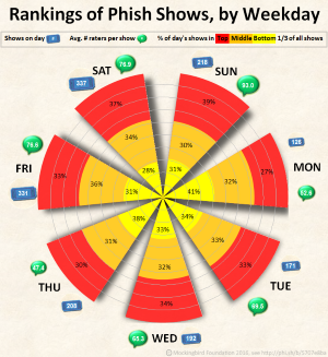
This stacked-petal polar chart**** uses red for the hottest third, and yellow for the bottom third. Each spoke within it illustrates how that day’s shows are distributed across these thirds. (Icons outside each spoke indicate how many shows happened that day and the average number of raters for each of them.)

If you lose by snoozing, it’s not on Monday: 41% of Monday shows are in the bottom third, while only 27% are in the top third – respectively, the highest and lowest proportions of any in the chart. Saturday seems least risky, with the smallest proportion at the bottom (28%); but Sunday more often had the highest payoffs, with the largest proportion (39%) in the top third. Of the rest, Friday fared best, while Tuesday and Wednesday were “merely” consistent, with about a third of each day’s shows in each third of all shows.

Travel Effects

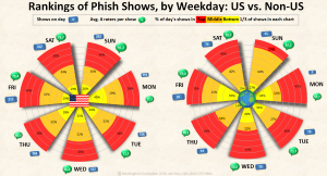
For more stark differences, compare shows within and beyond the United States. The aggregate statistics for domestic shows are close to the above. But shows outside the U.S. have either been weaker or simply judged more harshly: The top third of them have averages as low as 3.78, while the bottom third have averages all below 3.17!
US-Intl Spokes
US-Intl Spokes
Distributions across the week are even more stark than single summary statistics. Mondays fare decisively “worse” both domestically and abroad. But the strongest nights abroad have apparently been Thursdays (43% in the top third, and only 14% at the bottom!), while the weakest have been either Sundays (with only 13% at the top) or Fridays (with just over 50% at the bottom!)

Across the Eras

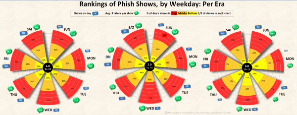
Finally, compare the weekly distribution of show ratings, as it changes across three eras of Phish (as commonly distinguished, with divisions at the hiatus and breakup). Even 2.0 shows have been better than non-US shows, on average, with the top third at 4.04 and above. And 3.0 shows have tended to be rated higher than 1.0 shows by small margins, whichever summary statistic is used.

But, again, the distribution across weekdays is even more pronounced: While there were far more Friday and Saturday shows in 1.0 (1983-2000), the distribution of ratings was relatively consistent across the week.
Eras Spokes
Eras Spokes
In 2.0 (2002-2004), Wednesdays were apparently the bomb: Only seven shows, but 57% of them were at the top, while none were at the bottom. Finally, so far in 3.0 (2009-2016), Monday through Thursday have apparently been meh, with about half of the shows in the bottom third for that era. But only about 1 in 5 weekend shows fall in the bottom third - and nearly half of Sunday shows are in the top third.

The weekend blowout is back, and you definitely shouldn't snooze on Sundays - at least, not in the U.S.

Methodological Notes

* There are three known concerns about ratings, addressed briefly here and thoroughly in coming posts:

  • First, the show ratings are a blunt instrument. Individual users might prioritize song choice(s), bustouts, overall setlist rarity, improvisational breadth (as a proportion of sound made at the show), improvisational depth (as variance from the composed notes, keys, rhythms, etc.), guest appearances, show length, venue characteristics, personal experience, esoteric characteristics or events, and/or other matters – if they discern with any clarity. Many judgements are more generalized, and some are more informed than others. Those differences are interesting - but measuring them separately would simply invite some form of combination, to provide an overall rating.

  • Second, there are some purported biases in the data, such as that a show is rated higher by actual attendees (compared to those on couch tour or listening later), by those who've seen fewer shows (which presumes that n00bs are less discerning and connoisseurs more critical), or because it occurred more recently (both from n00b bias and from a rose filter critical of the past). Some of them could potentially be incorporated into our statistical summary, but each has been addressed in previous forum posts presenting data analysis that somewhat undermines the assumptions they entertain.

  • Finally, there are known variations among raters: Some are more critical, giving only 4s and 5s, while others use the full range of available scores. The effects of differential use of the available ratings are somewhat mitigated by comparing relatively few categories, in the aggregate, across many hundreds of shows, from many thousands of ratings. Nonetheless, we are exploring variation among users and possibilities for standardizing scores per user. This blog post is the first in a series of analyses that have emerged from those investigations, and which illustrate a key point: Even without standardization, the ratings have valid meaning and uses.

** Despite flaws, the ratings are informative in three senses. Two are straightforward: They aggregate input from tens of thousands of users, about hundreds of shows. (Even the least discerning rater doesn’t give 5 stars to every show.) The third is empirical, and the point of today’s post: The show ratings are related to other variables of interest. That is, they may have predictive validity. (Similarly, you might critique DMV road tests, but they’re correlated with driving performance.)

*** All ratings data current as of April 8, 2016, at 1 a.m.

**** A stacked-petal polar chart (which might also be called a stacked circular column graph) is a dual variation on radar charts, using disconnected directional spokes, each with multiple values. (Here, bubble keys are also added for two additional variables.) Whereas the outwardly expanding widths of sector graphs (aka pie charts, et al) are subject to variable interpretation (by angle, arc, or area), concentric gridlines and series values are included here to emphasize that the salient aspect of spokes in these charts is length rather than area.

If you liked this blog post, one way you could "like" it is to make a donation to The Mockingbird Foundation, the sponsor of Phish.net. Support music education for children, and you just might change the world.


Comments

, comment by tubescreamer
tubescreamer The kind of post I am hoping to read when I sit down and open .net with my breakfast, thanks!
, comment by paulj
paulj Once again, very cool. The relatively small sample sizes, by day, of the non-U.S. shows and 2.0 era (in particular) make me wonder about statistical significance. I'm not sure we're seeing any cross-era differences. Future research?
, comment by Lemuria
Lemuria @paulj said:
Once again, very cool. The relatively small sample sizes, by day, of the non-U.S. shows and 2.0 era (in particular) make me wonder about statistical significance. I'm not sure we're seeing any cross-era differences. Future research?
There aren't any sample sizes, because they aren't any samples: These are populations. Statistical significance is typically a question of whether samples are large enough to make inferences *to* a population from which the sample was selected - but there's no such question here, because there's no such jump: The data include *all* known cases, and there are definitely cross-era differences.
, comment by Phrancois
Phrancois This is great stuff! My $0.02 is that the chart would be visually even more compelling if the size (i.e. angle) of the petals was proportional to the number of shows for each day.
, comment by ColForbin
ColForbin Nice work, @Lemuria !
, comment by Lemuria
Lemuria @Phrancois said:
This is great stuff! My $0.02 is that the chart would be visually even more compelling if the size (i.e. angle) of the petals was proportional to the number of shows for each day.
I initially created them that way, but found them more difficult to read - the petals themselves, as well as the icons and labels on the ends, which became oddly clumped in some places. Two (possibly three) coming radar charts will include petals of varying angles, and several will have petals of varying lengths - but the next will instead have consistently *narrower* petals, with variable beginnings... coming next Wednesday! :)
, comment by Rutherford_theBrave
Rutherford_theBrave Cool article Lemuria
, comment by dscott
dscott The low ratings for non-USA shows are most likely a reflection of the high proportion of short, jamless single-set gigs.
, comment by WolfmanCO
WolfmanCO Thanks for all the hard work, interesting read! I think it's cool that in the stats you can see the impact of the internet and how woven into the fabric of life it has become; the average number of raters for 1.0 and 2.0 is solidly in the 30's per show. Then, in 3.0 (Smartphone era) the average raters for shows jumps to 160-200+.
, comment by tennesseejac
tennesseejac Yeah!! This is great. I was looking at stats about 2 months ago when I was trying to decide which shows to see this tour, so I averaged the 5 star rating scores by venue. Here's what I came up with:

DCU Worcester (16 shows) = 4.2771875
Dicks (15 shows) = 4.233733333
SPAC (16 shows) = 4.1545
MSG (35 shows) = 4.114657143
Deer Creek (22 shows) = 4.104909091
The Gorge (14 shows) = 4.042357143
BGCA (9 shows) = 4.008
Alpine Valley (17 shows) = 4.022705882
MPP (14 shows) = 3.996786
Mann PA (8 shows) = 3.998
LA Forum (3 shows) = 3.951
Red Rocks (13 shows) = 3.890923077
Hampton (18 shows) = 3.758888889
, comment by BetweenTheEars
BetweenTheEars This is great! Nice work @lemuria, love the deep statistical digging.

Some brainstorms that happened as I was reading the article about some ratings-related things the raw numbers would help suss out:

- Are different eras consistently rated higher/lower than others? I'd love to see a histogram (or a bell curve generated using a historgram) of the ratings for shows by era

- Are different years consistently rated higher/lower than others? Same idea as the first one, but by year instead of era.

- Is it possible to drill down to all of the individual ratings of particular shows? If so, are there certain shows that are more "polarizing" than others? i.e. shows whose ratings have a high Coefficient of Variation (or since the ratings scale is a consistent 0-5 for all shows, perhaps all you'd need to do is compare std. deviations). Conversely, are there some shows where the consensus is nearly unanimous and have a very tight cluster of ratings?

- Is it possible to track a show's average rating over time? I would be neat to try and take a quantitative look at "recency bias". Take a few shows that occured after the ratings system was put in place, and then bin the ratings within the first day, days 2-7, days 8-31, and days 31-365, or something like that.

Can't wait until next week's article!
, comment by Lemuria
Lemuria I have graphs in the works on the first 3 of those. We dont have the facility to track the 4th, but I do have ratings data from several arbitrary dates and could compare those over time, fwiw.
, comment by SimpleMike
SimpleMike @Lemuria said:
@paulj said:
Once again, very cool. The relatively small sample sizes, by day, of the non-U.S. shows and 2.0 era (in particular) make me wonder about statistical significance. I'm not sure we're seeing any cross-era differences. Future research?
There aren't any sample sizes, because they aren't any samples: These are populations. Statistical significance is typically a question of whether samples are large enough to make inferences *to* a population from which the sample was selected - but there's no such question here, because there's no such jump: The data include *all* known cases, and there are definitely cross-era differences.
I think paulj just meant that the surprising properties of the 2.0 and non-US charts may be mostly due to the small number of shows looked at. A small sample is less credible / more volatile.
, comment by SimpleMike
SimpleMike @SimpleMike said:
@Lemuria said:
@paulj said:
Once again, very cool. The relatively small sample sizes, by day, of the non-U.S. shows and 2.0 era (in particular) make me wonder about statistical significance. I'm not sure we're seeing any cross-era differences. Future research?
There aren't any sample sizes, because they aren't any samples: These are populations. Statistical significance is typically a question of whether samples are large enough to make inferences *to* a population from which the sample was selected - but there's no such question here, because there's no such jump: The data include *all* known cases, and there are definitely cross-era differences.
I think paulj just meant that the surprising properties of the 2.0 and non-US charts may be mostly due to the small number of shows looked at. A small sample is less credible / more volatile.
EDIT: It's true they aren't samples so I suppose volatility is really what we're talking about.
, comment by Mistercharlie
Mistercharlie Aww yeah, and Deer Creek is on a Sunday this year! Bring on the jamz!
, comment by paulj
paulj @Lemuria said:

There aren't any sample sizes, because they aren't any samples: These are populations. Statistical significance is typically a question of whether samples are large enough to make inferences *to* a population from which the sample was selected - but there's no such question here, because there's no such jump: The data include *all* known cases, and there are definitely cross-era differences.
Holy sh*t. I remember making this same argument years ago when making a comparison of teaching evaluations at the department level. You're right.
, comment by SimpleMike
SimpleMike @paulj said:
@Lemuria said:

There aren't any sample sizes, because they aren't any samples: These are populations. Statistical significance is typically a question of whether samples are large enough to make inferences *to* a population from which the sample was selected - but there's no such question here, because there's no such jump: The data include *all* known cases, and there are definitely cross-era differences.
Holy sh*t. I remember making this same argument years ago when making a comparison of teaching evaluations at the department level. You're right.
Your intuition is still relevant even though it isn't a sample. Outliers are more impactful to summary statistics in data sets with a small number of points.

If you look at every phish show in 2002 you can confirm that it didn't rain in any of the shows that year. That's an interesting pattern until you consider that there was only one show that year. When we see interesting patterns in small data it is reasonable to question whether the patterns are meaningful or simply a consequence of the data being limited.

I think this was paulj's observation.
, comment by Gumbro
Gumbro I just love the amount of nerdery that happens here. That is all. Gonna go listen to a Sunday show now...
, comment by humalupa
humalupa This is very cool slicing and dicing of data regarding overall show ratings, but Sunday shows are also revered for their purported high rate of bust-outs, a la Alpine Valley 2015. I'd be curious to know whether the data support a statistically-significant increase of rare songs and bust-outs on Sundays over any other day of the week.
, comment by Lemuria
Lemuria @humalupa said:
I'd be curious to know whether the data support a statistically-significant increase of rare songs and bust-outs on Sundays over any other day of the week.
That's OTW, penciled in ~2 weeks from now. First (next up): predictability :)
You must be logged in to post a comment.
Support Phish.net & Mbird
Fun with Setlists
Check our Phish setlists and sideshow setlists!
Phish News
Subscribe to Phish-News for exclusive info while on tour!


Phish.net

Phish.net is a non-commercial project run by Phish fans and for Phish fans under the auspices of the all-volunteer, non-profit Mockingbird Foundation.

This project serves to compile, preserve, and protect encyclopedic information about Phish and their music.

Credits | Terms Of Use | Legal | DMCA

© 1990-2025  The Mockingbird Foundation, Inc.